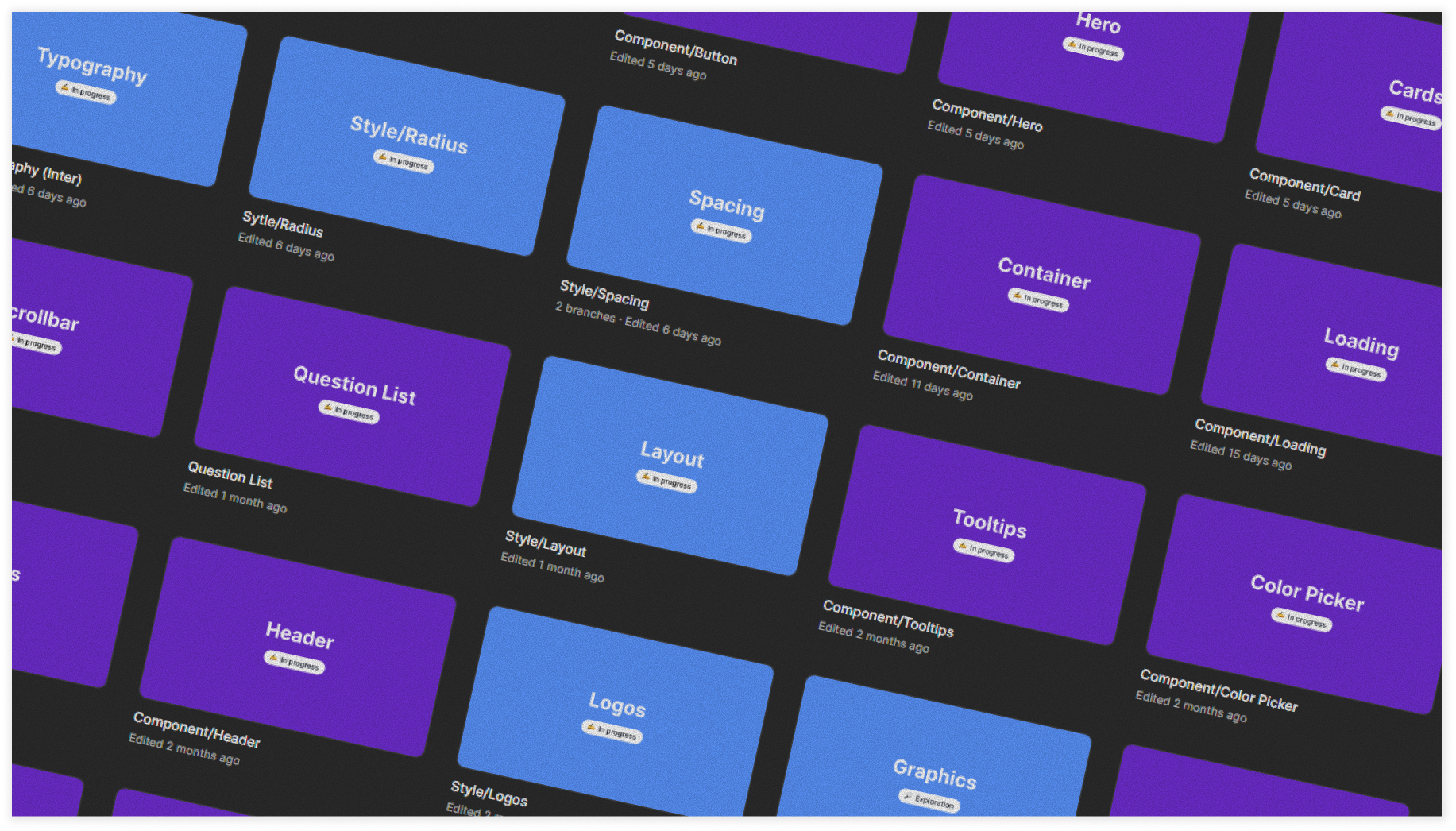
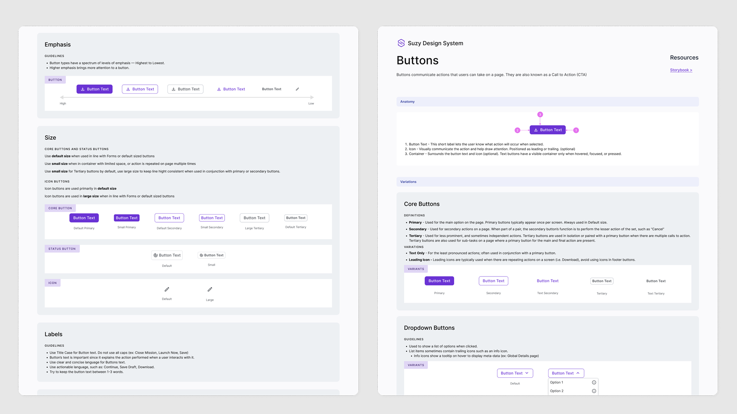
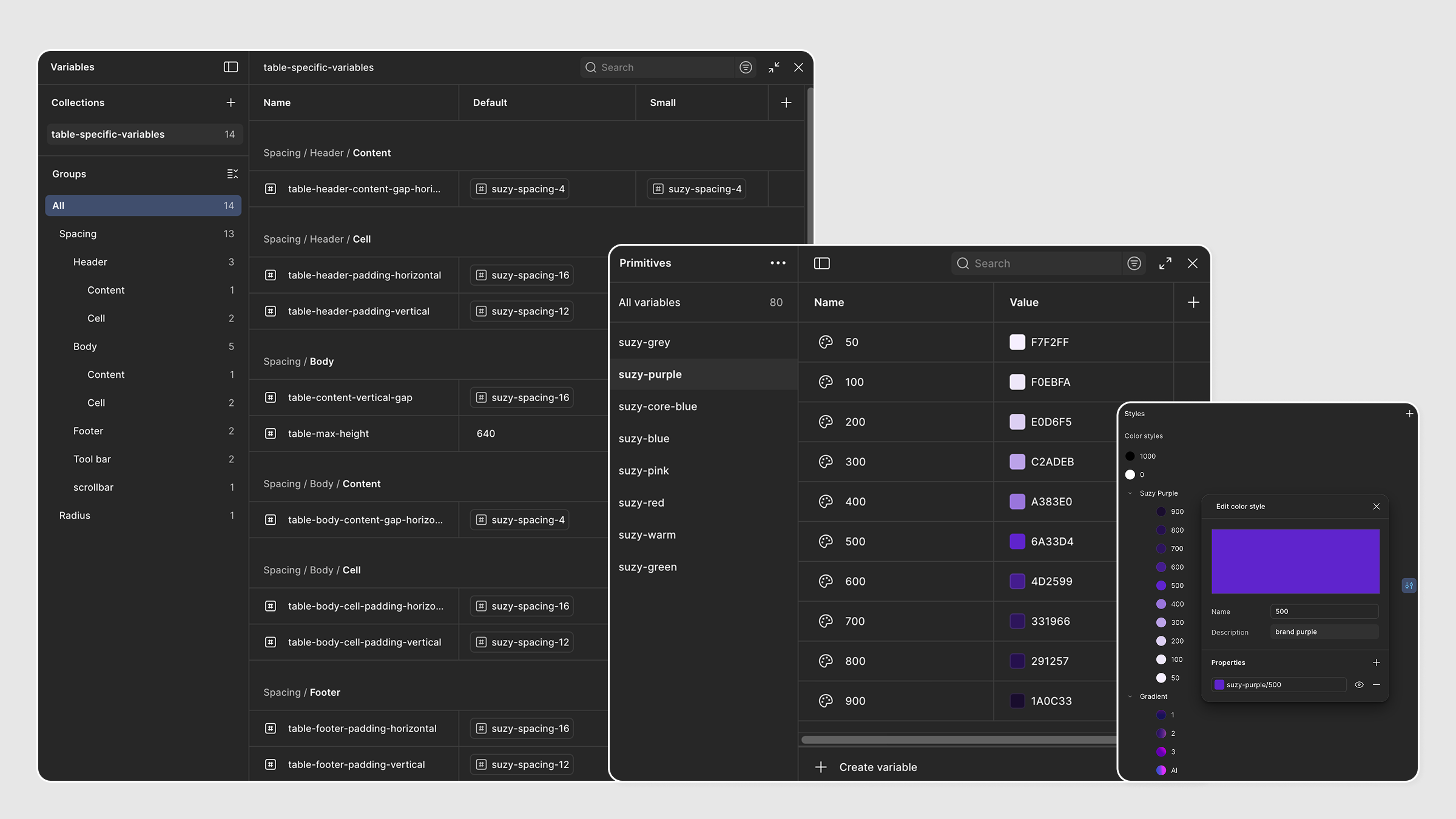
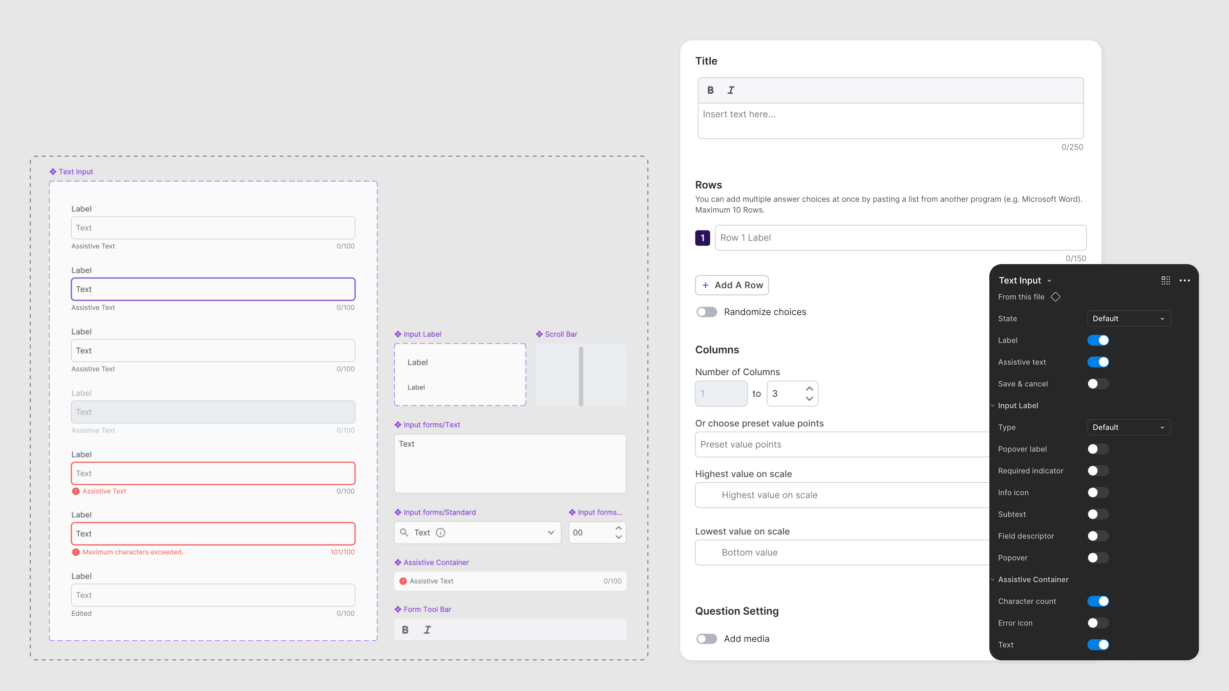
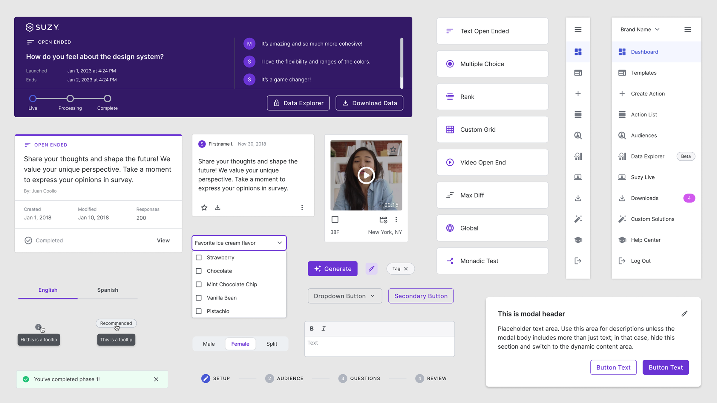
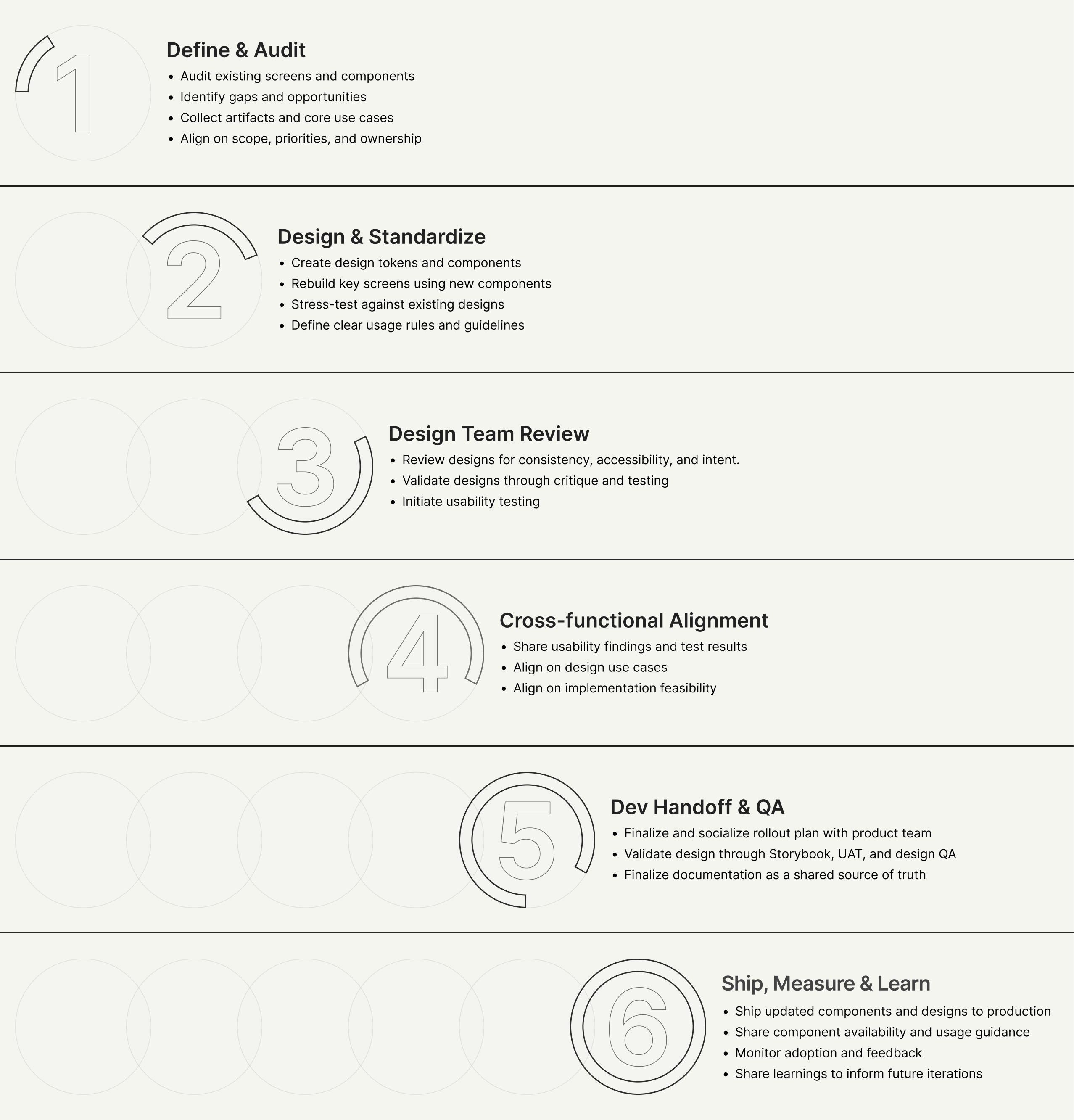
The Design System work went beyond UI polish and component creation. We used this effort as an opportunity to address long-standing UX issues that had accumulated in the backlog.
By standardizing layout, spacing, and component behavior, we were able to improve information density, reduce unnecessary vertical space, and simplify high-traffic workflows. Many of these changes were informed by existing user feedback and internal pain points rather than visual preference alone
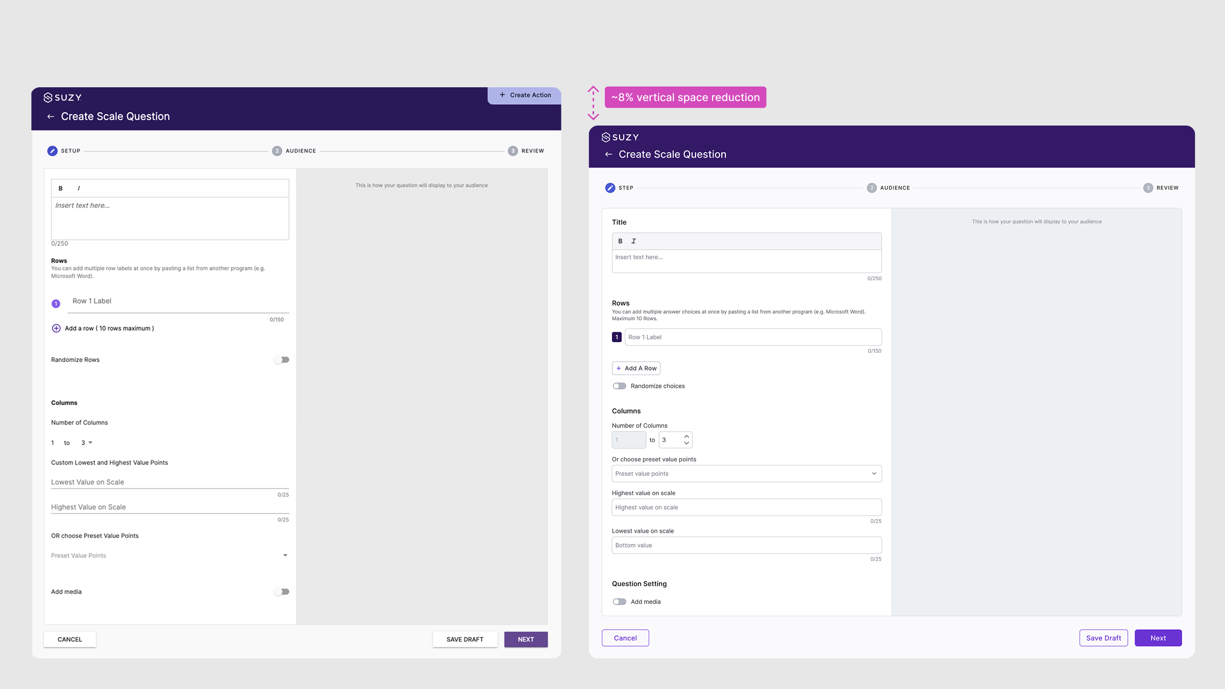
The original screen used legacy Material Design v1 line-only inputs, which led to unclear boundaries and inconsistent spacing in a long configuration flow.
We brought back outlined inputs to restore clear boundaries between fields. Fields were reorganized into more logical groups to improve readability and flow. The Suzy Grid System was applied to standardize spacing across sections, reducing wasted vertical space by about 8%.
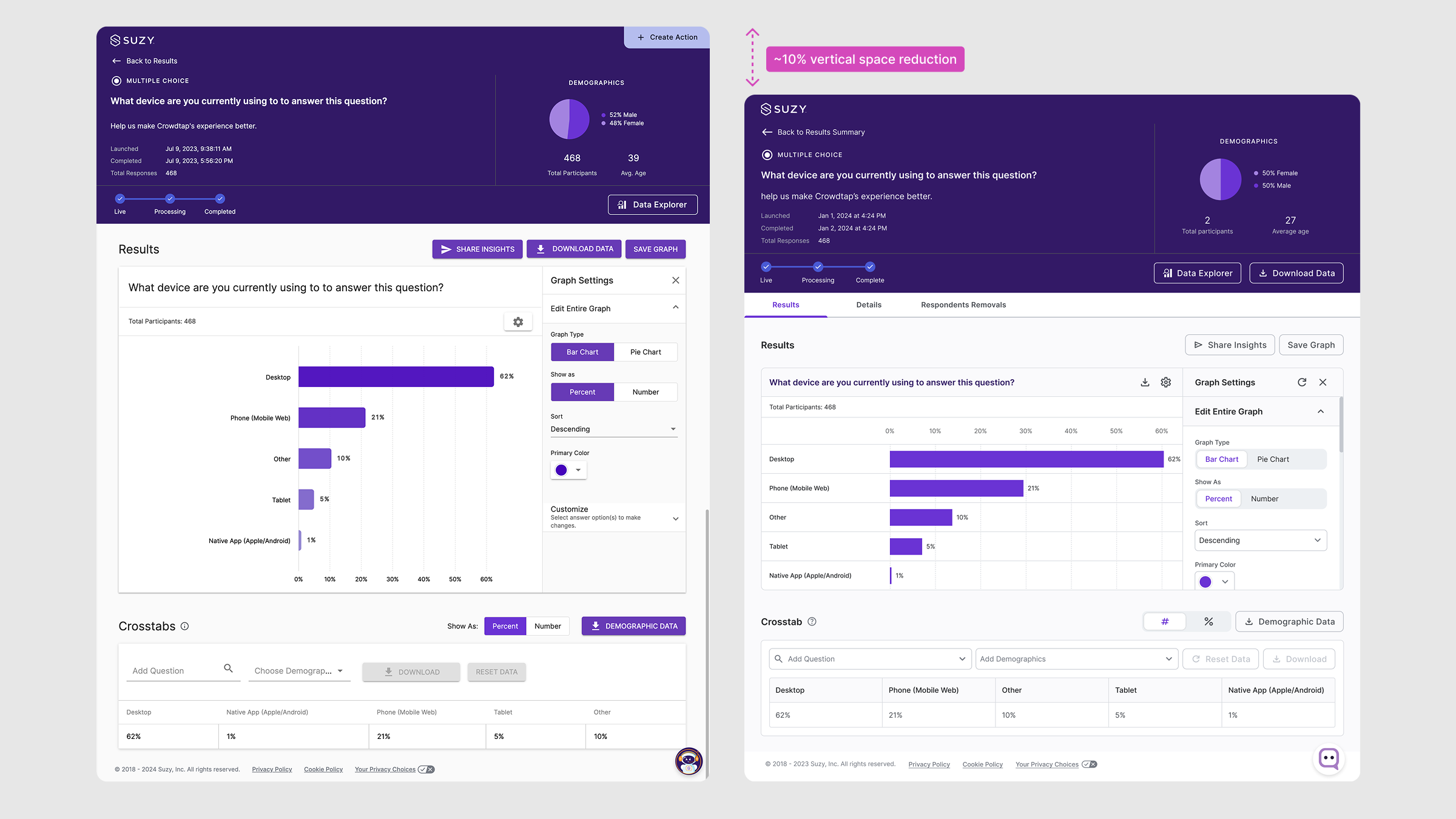
In this example, the original screen overused the brand color across actions, with multiple shades of purple competing for attention and weakening the meaning of primary actions. A persistent primary button dominated the header, even though the page’s intent was to review results. We standardized brand color usage, reduced primary actions, and reserved primary button for true next steps. This clarified action hierarchy, reinforced brand consistency, and made the results experience easier to focus on without removing functionality.